



SendGrid
A deprecated style guide for developing consistent UI/UX at SendGrid, based on modular components and OOCSS/SMACSS principles.
Score
50
User Rating
1.0
Free/Trial Support
Supported
Starting Price
--
Last Updated
Jun 08, 2026
Overview
What is SendGrid?
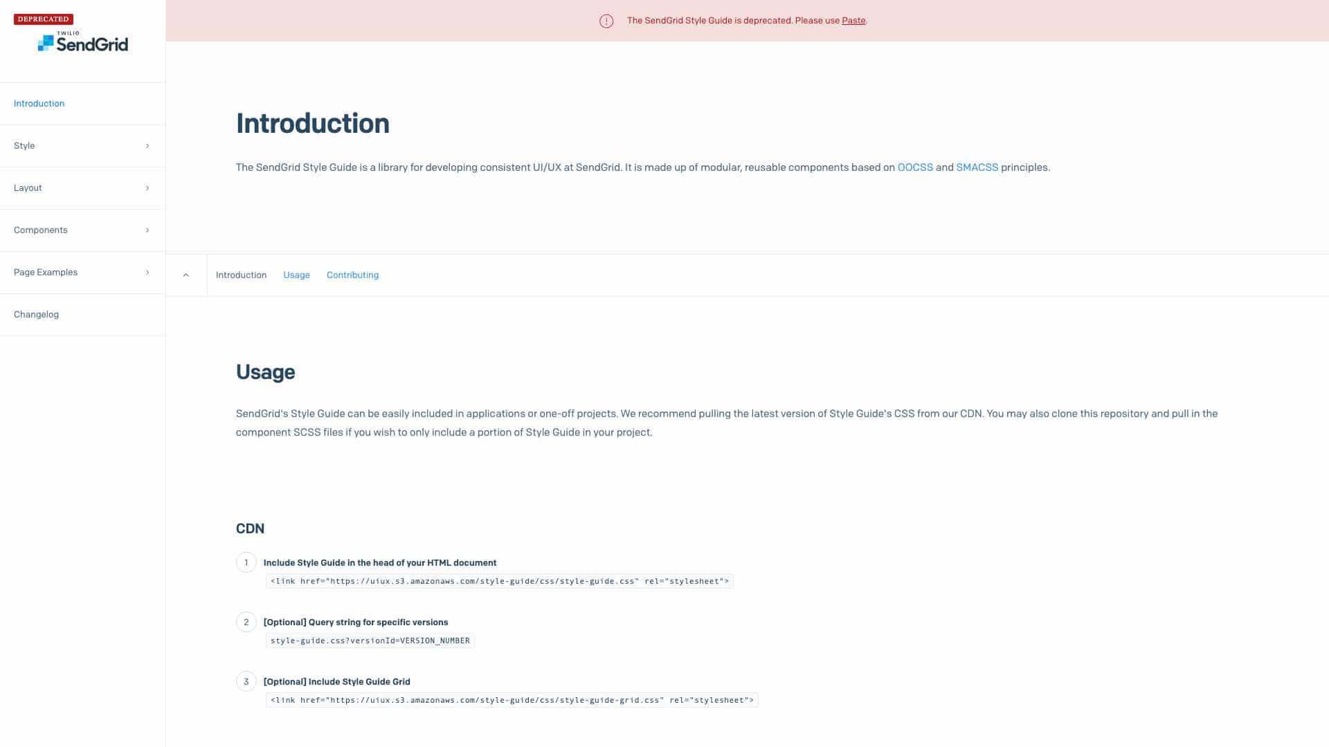
The SendGrid Style Guide is a library for creating consistent user interfaces at SendGrid, built with modular, reusable components following OOCSS and SMACSS methodologies. It includes CSS files and React components for easy integration into projects.
What is SendGrid used for?
Top Features
- Modular components
- CSS framework based on OOCSS/SMACSS
- React component library
- CDN support for easy inclusion
- Local development with Gulp and Node.js
How to use SendGrid?
Include the CSS from a CDN in your HTML head or clone the repository to use specific SCSS files. For React projects, use the UI Components library that implements the style guide as encapsulated components with logic and markup.
Alternative Tools
No alternative tools found
Pros & Cons
Pros
- Promotes UI consistency
- Reusable components save development time
- Supports both CSS and React integration
- Easy to deploy and customize
Cons
- Deprecated (replaced by Paste)
- Limited to SendGrid's specific use cases
- Requires Node.js for local development
Use Cases
- Building consistent UIs for SendGrid applications
- Prototyping UI components quickly
- Integrating design systems into React projects
SendGrid Pricing
Free Plan
No detailed pricing information available
User Reviews
1.0
out of 5
1.0
No reviews yet
Be the first to review this tool!