


Seek
A design system and style guide for SEEK, providing UI components and principles to ensure consistent, accessible, and user-friendly interfaces.
Score
60
User Rating
1.0
Free/Trial Support
Not Supported
Starting Price
--
Last Updated
Jun 08, 2026
Overview
What is Seek?
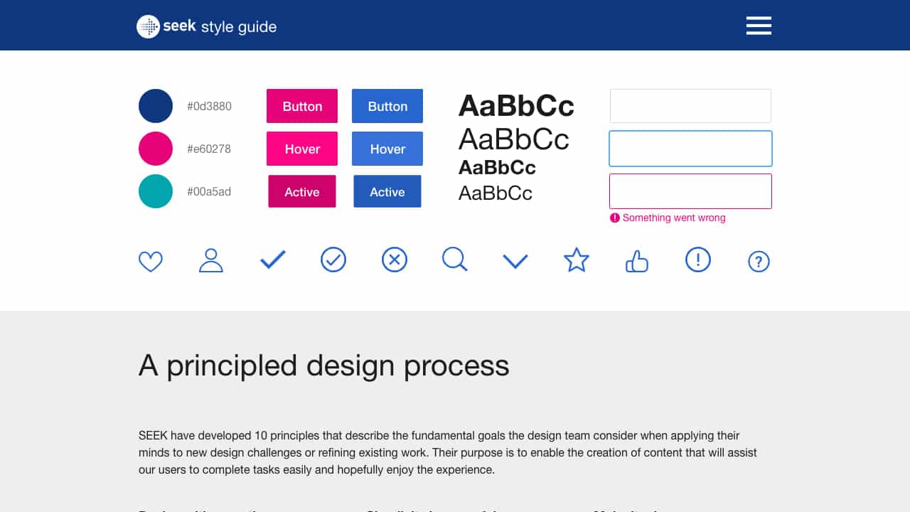
SEEK Style Guide is a comprehensive design system that includes a color palette, typography, layout components, and interactive elements like buttons and forms. It is built on 10 design principles focused on empathy, transparency, simplicity, and accessibility to help users complete tasks easily.
What is Seek used for?
User Groups
Top Features
- Color palette and typography guidelines
- Interactive UI components (e.g., buttons, forms)
- Layout components (e.g., cards, accordions)
- Design principles for empathy and accessibility
- Consistency and brand alignment tools
How to use Seek?
Use the style guide to implement consistent UI components across web applications. Designers can apply the principles to new projects, while developers can integrate components like buttons, forms, and layout elements into their codebase for a cohesive user experience.
Alternative Tools
No alternative tools found
Pros & Cons
Pros
- Promotes brand consistency and user trust
- Enhances accessibility and usability
- Supports responsive and touch-friendly design
- Based on data-informed and empathetic principles
Cons
- May require adaptation for non-SEEK brands
- Limited to web platform implementation
Use Cases
- Building or redesigning job-seeking platforms
- Ensuring UI consistency in enterprise applications
- Training design teams on principled design processes
User Reviews
1.0
out of 5
1.0
No reviews yet
Be the first to review this tool!